Monthly Archives: July 2016

Minimum Spanning Trees and G10FX implied volatilities…

I have always been keen on clustering methods as they are a practical way to visualise meaningful relationships that may exist in the somehow chaotic financial markets…..Following my previous post on the subject I decided to extend this to FX Implied volatilies…

The following charts show how major 1-month FX volatilities have been trading over the last 20-years and for 2016.

plot of chunk charts

The folowing charts shows the correlations of daily changes since 1996 and for 2016.

plot of chunk correlation

The below plot the minimum spanning tree for G10FX implied vols. The distance between the nodes being a function of the above correlations. Some groupings are quite intuitive…some other less so…I would say the recent period seems to be at odd with the period 2010-2015 where we had two specific group: one for European currencies the other for commodity currencies….

plot of chunk mst

If you want a natter about this or just to exchange some ideas on the subject or other concepts presented in my blog, contact me at Pierre@argonautae.com

G10 FX Position Report Update

G10 FX POSITIONING REPORT

Sun Jul 17 21:02:23 2016

The following report aims to provide a gauge to the current market positioning in G10 FX. It focuses on US$ crosses and uses a standardised statistical measures of price deviation as well as a regression methodology to produce an estimate of how stretched currency exchange rates are and also to evaluate how currency managers are likely to be positioned and leveraged in G10 Currency. I use the BTOPFX in the report but can do the computations for any other peer group benchmark.

G10 FX STRETCH MAP

The stretch indicator looks at how much exchange rates are extended by calculating the T-stat of the mean price deviation over a rolling period of 61 days. The charts below shows the results for each currency pairs over the last 500 days. The spot prices are expressed as 1 unit of foreign currency versus the USD. The purple line represent the median value since 2005 and the red lines represent the 95% confidence intervals. Therefore if the value is above or below those the deviation of the given exchange rate would be deemed as atypical relative to what would be expected under a normal distribution and therefore overbought/oversold.

plot of chunk stretch line chart

The below shows the above calculated T-stats but this time relative to their historical distributions. Once again the red lines delimit the 95% confidence intervals and the purple line the median value. The blue line indicates the most current value of the T-stat.

plot of chunk stretch distribution

The following Map chart shows how stretched G10 FX exchange rates are over time horizons ranging from 1-month to 6-month. The bigger the square the most significant the upside (green) or downside (red) of the exchange rate over the given period. All the exchange rates are quoted on CCY-US$ basis so red indicate a depreciation of a given CCY against US$ and green an appreciation versus the US$.

plot of chunk stretch map

Estimated Currency Managers Positioning in G10 FX

To determine the sensitivity of currency managers to exchange rates and therefore their current positioning we regress the daily returns of the BTOPFX index against the daily logarithmic returns of G10 FX rates. We then calculate the T-stat for each of the regression’s slope coefficients. The higher the T-stat the higher the sensitivity to a given currency and therefore likely positioning. Using the regression weights as well as the variance of the independent and explanatory variables as input we can then easily deduce an estimation of the current risk utilisation of the typical currency manager as inferred by the values of the BTOPFX.

The below shows the T-stat of the regression’s slope coefficients over the last 500 days. The purple line represents the median value since 2005 and the red lines represent the 95% confidence intervals. Therefore if the value is above or below the red lines the positioning in a currency would be deemed as extreme and therefore the risk of unwinding would be greater since the market inventory would likely be close to its highest. Probably highlighting a good environment to enter a contrarian trade.

plot of chunk sensitivity line chart

The sensitivity of currency managers returns to changes in G10 FX rates relative to their historical distribution is shown below. Once again the red lines are the 95% confidence intervals and the purple line the median value. The blue line indicates the most current value of the T-stat. If this one is either side of the intervals of confidence it indicates a potentially overextended market positioning in the given currency.

plot of chunk sensitivity distribution

The exposure to the US$ is derived from the combined sensitivities to the other currencies and is shown in the same fashion than for the other currencies. Namely against an axis of time and relative to its historical distribution.

plot of chunk USD sensitivity

The below Map chart shows the currency managers sensitivity to G10 FX exchange rates over time horizons ranging from 1-month to 6-month. The bigger the square the most significant the sensitivity to a currency the exchange rate over the given period. Long positioning is shown in green and short in red.

plot of chunk sensitivity map

Estimated Leverage

As explained previously the level of risk utilisation of currency managers and therefore their gearing can easily be derived by using the regression coefficients and the variances of both the independent and explanatory variables. The chart below shows the rolling estimation of risk utilisation as well putting it in respect of its historical distribution. Average Risk utilisation over the last 61 days is estimated at 31.24 % of maximum.

plot of chunk leverage

G10 FX Risk Report Update

The following analysis uses a proprietary G10 FX implied volatility index which I created quite a few years ago. The index is a G10 FX 1-month implied volatility index which weights are derived from the BIX FX triennal surveys for the year 2001,2003 & 2007. If you want more information on the exact formulation of the index feel free to contact me pollux@argonautae.com for a chat. For the time being suffice to say that the G10 FX volatility index is a broad and accurately weighted measure of G10 FX risk.

In my approach I recognise that the nominal level of implied volatility is a crude metric of risk therefore I also use two other measures, namely Volga and the ShockIndex. The Volga is simply the volatility of the G10 FX volatility index over a given period. This measure highlights how uncertain and unstable the level of risk in G10 FX has become. Though generally positively correlated those measures of risk can diverge from time to time. You can have a high level of volga whilst G10 FX volatilities are trading at rather innocuous levels. This is not a trivial observation as the leverage undertaken by market participants tends to be an inverse function of market volatility which implies a greater vulnerability when volatility becomes uncertain at low levels and therefore cannot be accurately budgeted for. The ShockIndex is the ratio between the Volga and the G10 FX volatility index at the beginning the historical window chosen to evaluate the Volga. It quantifies sharp changes and acceleration in risk levels. Historically it has proven to be a good classifying measure for market event risks in FX markets.

The below charts shows those three measures both relative to a time axis and their historical distribution. The red lines are the 95% confidence intervals, the purple line the median. The blue line highlight the current level. The Volga and ShockIndex in this report are evaluated over a period of 14 days. The medians and 95% confidence intervals are calculated over the full history going back to 1996 though the charts shows only the recent years.

plot of chunk riskchart

At close of business the 2016-07-15 the G10 FX volatility index was estimated at 10.1 % at the 85.3 percentile. The 14-day G10 FX Volga was estimated at 13.3 % its 97.8 percentile and the shockindex at 1.1 or its 94.5 percentile.

The above charts are useful, however their visualisation is quite limiting. On the one hand we need quite a few charts to present the data on the other hand it is difficult to show the full G10 FX volatility Index history going back to 1996 as this would make the charts unreadable. Therefore clustering and aggregating the whole data into a single chart should be useful to the end user. To answer this I use a mapping technique developed by Kohonen in the 1980′. It uses an unsupervised neural network to re-arrange data around meaningful clusters. Though computationally complex is a practical way to summarise multidimensional data into a low (usually 2) dimensional system.

The below chart shows how the G10 FX Volatility Index history was split into 4 distinct clusters. Those clusters where computed not only as a function of the G10 FX Volatility Index level but also as a function of the other discussed variables, namely Volga and Shockindex.

Since 1996 the G10 FX volatility Index traded 58 % of the time in Cluster 1, 30 % in Cluster 2, 8 % in Cluster 3 and 3 % in Cluster 4. Overall the layering provided seems quite intuitive as the increase in risk and time spent in each cluster points toward what would generally be expected from market risk regimes ranging from low to high risk.

plot of chunk cluster_chart

In the chart below we zoom on the various regimes within which the G10 FX Volatility Index hasevolved for the current year. so far it remained 66 % of the time in Cluster 1, 24 % in Cluster 2, 10 % in Cluster 3 and 0 % in Cluster 4.

plot of chunk ytdriskchart

Finally the below chart shows a Self Organising Map of the above mentioned risk metrics. The data has been grouped and colored as a function of four clusters of increasing market risk regimes. Obviously as shown on the map, the minimum level of volatility pertains to cluster 1 and the highest to cluster4. The current regime and its progression from 21 days ago is also highlighted on the map.

plot of chunk SOM_chart

G10 FX Implied Volatilities: Cheap or Expensive ?

The following report provides a granular analysis of implied volatilities within G10 FX. I use primarily the same formatting than for my G10FX positioning report to estimate how extended the 1-month FX implied volatilities are over various time horizon.

The first set of charts shows the historical T-stat of the 1-day changes in 1-month implied volatilities over a rolling period of 61-days. This is my statistical metric to quantify how stretched the implied volatilities are, but clearly other time period could be used as shown further down on in that report. The purple line represents the median value since 1996 and the red lines represent the 95% confidence intervals. Therefore if the value is above or below those the deviation of the given implied volatility should be deemed as atypical relative to what would be expected under a normal distribution (I am not saying that implied volatilities have a normal behaviour to be clear….) and therefore overbought/oversold.

plot of chunk stretch line chart

The below charts shows the current implied volatilities relative to their historical distributions since 1996. Once again the red lines delimit the 95% confidence intervals and the purple line the median value. The blue line indicates the most current level of 1-month implied volatility.

plot of chunk stretch distribution

Finally the below shows a stretch map of the T-Stats to help visualise how much implied volatilities have departed from their equilibrium levels over time horizons ranging from 1-month to 6-month. The bigger the square the most significant the observed upside (Green) or downside (Red) of the implied volatility over the given period.

plot of chunk stretch map

GBP TWI Break Analysis…

In the following I us an R package BFAST designed to detect strucutural breaks in time series.The script Iteratively detects breaks in the seasonal and trend component of a time series. The first chart shows the various break and fitted regressions. The second chart shows the deviations from the regression lines and 95% interval of confidence. This can be used as an overbought/oversold indicator. Anyway, just work in progress…so any input / suggestions are always welcome as usual. Feel free to contact me at:Pierre@argonautae.com

plot of chunk plot plot of chunk plot

GBP TWI update….

Whatever the market being traded, there always will be a a question being asked at one moment: How far can this thing go ? Clearly not an easy question to answer as this will invariably depends on factors that are partly unknown or difficult to estimate, such as fundamentals, market positioning or market risk amongst others. The first part is obviously to assess how atypical the move experienced in the given instrument is. This report aims to contribute to this.

The below chart shows the GBP TWI over the period of January 1990 to July 2016 . On the 08 July 2016 it was trading around 78.2357.

plot of chunk chartdata

In the below I plot the previous 125 days against other similar historical periods that would have closely matched the recent history. The data has been normalised so as to be on the same scale. The chart shows the latest 125 days in black, and overlay similar historical patterns in grey. It Also shows what has been the price path for the following 125 days as well as the observed quartiles.

plot of chunk pattern

Finally I plot the last 125 days and a trend forecast derived from an ARIMA(0,1,0) model as well as the 95% confidence intervals. The ARIMA model is fitted to the past 625 historical values whilst ignoring the last 125 days, therefore we can look at the recent price path against the trend forecast and its confidence intervals to gauge how (a)typical the recent move has been.

plot of chunk arimaplot

UK Investor Allocation Update

The below is a generic asset allocation report produced from the perspective of a UK investor. I use the Barclay UK Gilts all maturities index, the MSCI World ex UK and the MSCI UK Gross indices (i.e dividends re-invested) as proxies for bonds and equities holdings. As time goes I will add a few more asset buckets such as EM, commodities and properties. So see this as a first attempt to an evolutive product.

The below charts shows the rolling 36-month return, volatility and risk adjusted return for each of the assets used in the final portfolio. Clearly equities have a higher volatility than bonds but also higher/lower localised returns highliting that timing is key in unlocking those higher returns.

plot of chunk Summary charts
The below summary performance statistics show that a UK investor would have got the best risk adjusted return by holding a broad basket of Gilts. Over the long term the returns would have been quite similar accross asset classes. However the risk as expressed by the annualised volatility of the monthly returns and the maximum drawdown would have been at it highest for equities and particularly for World Ex. UK stocks.

##                                 Gilts World Ex UK Stocks UK Stocks
## Annualized Return                9.00              10.78     10.39
## Annualized Standard Deviation    6.59              15.92     15.86
## Annualized Sharpe Ratio (Rf=0%)  1.37               0.68      0.66
## Worst Drawdown                  11.42              52.51     44.04

In the following I use a mean-variance model to compute the weights of the portfolio that maximises the information ratio on the efficient frontier.The model is optimised for “long only” and weights adding to one constraints. I use a rolling window of 36-month to estimate the returns, volatility and correlation input fed into the Markovitz model. The use of a rolling window implies that the momentum effect in the input is captured by the optimisation. Therefore if an asset becomes more attractive through time in terms of its risk adjusted return and/or diversification potential its participation into the final portfolio should increase and vice versae.

The two charts below show how the optimised portfolio weights have changed throughout time and also what were the weights at the end of the last month.

plot of chunk weights_chart
Using the above weights I then calculate the return of the portfolio for the folowing period assuming a cost of 0.25% of adjusted notional for each monthly rebalancement. The performance is compared to the return of a portfolio composed of 60% Gilts and 40% UK equities.

plot of chunk Opt_porfolio_charts

**Summary Performance Statistics

##                                 Benchmark 60/40 Optimal Portfolio
## Annualized Return                          8.68              8.28
## Annualized Standard Deviation              7.84              5.94
## Annualized Sharpe Ratio (Rf=0%)            1.11              1.39
## Worst Drawdown                            13.54             11.26

Drawdowns Table

##                  From              Trough                  To  Depth
## 1 1994-01-31 00:00:00 1994-05-30 23:00:00 1995-05-30 23:00:00 -11.26
## 2 1990-01-31 00:00:00 1990-04-29 23:00:00 1990-11-30 00:00:00  -9.49
## 3 1986-09-29 23:00:00 1986-09-29 23:00:00 1987-01-31 00:00:00  -6.06
## 4 2009-01-31 00:00:00 2009-01-31 00:00:00 2009-08-30 23:00:00   -5.1
## 5 2008-01-31 00:00:00 2008-06-29 23:00:00 2008-12-31 00:00:00  -5.07
##   Length To Trough Recovery
## 1        17     17        5
## 2        11     11        4
## 3         5      5        1
## 4         8      8        1
## 5        12     12        6

Monthly Returns

##       Jan  Feb  Mar  Apr  May  Jun  Jul  Aug  Sep  Oct  Nov  Dec YEARLY
## 1984  1.6 -1.9  4.1  0.2 -4.4  1.7 -1.6  7.0  2.9  2.1  2.1  0.9   14.6
## 1985  1.6  1.8 -1.1  0.7  1.4  0.2  1.1  1.8  1.2  1.0  0.8  0.8   11.3
## 1986 -0.1  5.0  7.2  1.9 -0.2 -0.5  0.2  2.4 -6.1  1.0  0.0  3.1   13.9
## 1987  3.6  2.9  3.2  2.2  1.3 -1.0 -1.1 -0.5  0.6 -2.3 -0.4 -0.3    8.1
## 1988  2.9  2.0  1.0 -0.1  0.4  0.3  1.0 -1.7  2.7  1.8 -1.8  1.5   10.0
## 1989  3.2 -0.3  0.8  0.8  0.0  0.8  3.5  0.6 -1.3  0.8  0.1  1.9   11.1
## 1990 -3.5 -2.1 -2.5 -1.7  5.8  2.0 -0.3 -1.3 -0.8  3.9  3.0  0.3    2.8
## 1991  3.7  1.9  1.2  0.4  0.3  0.3  2.3  1.9  2.4  0.4 -0.4  1.3   15.8
## 1992  2.5  1.3 -2.4  4.1  2.1 -0.4 -0.2 -1.0  4.0  5.2 -1.0  2.5   16.6
## 1993  1.3  2.2  0.8 -1.3  0.5  3.3  2.4  3.4  0.1  1.3  1.9  3.6   19.8
## 1994 -0.1 -3.6 -3.3 -1.1 -3.7  0.5  1.4  0.9 -1.2  1.0  2.1 -0.5   -7.4
## 1995  1.1  0.5  1.4  1.3  3.6 -2.2  2.3  1.4  0.4  1.2  3.7  1.3   15.9
## 1996  0.9 -1.9  0.2  1.9 -0.5  1.6 -0.1  0.7  2.1  0.0  2.3 -0.9    6.3
## 1997  2.3  1.1 -1.7  1.9  2.2  1.0  1.6  0.0  3.8  0.2  0.6  1.8   14.8
## 1998  1.9  0.2  1.7  0.9  1.2 -0.3  0.9  3.1  3.2  0.0  3.1  2.2   18.1
## 1999  1.1 -1.7  0.8  0.1 -1.6 -0.1 -1.0  1.2 -2.2  2.1  1.6 -0.5   -0.2
## 2000 -1.7  1.7  1.4  0.9  0.5  0.4  0.0  0.0  0.4  1.0  1.8  0.6    7.2
## 2001  0.5 -0.4 -0.3 -0.9 -0.6 -0.4  1.9  1.1 -0.9  3.3 -0.2 -2.0    1.0
## 2002  1.2 -0.4 -1.5  0.7 -0.1  1.2  0.2  2.2  0.3  0.1 -0.1  1.0    4.7
## 2003  0.3  1.0 -0.6  1.2  2.4 -0.5 -1.1  0.4  0.4 -1.4  0.4  2.4    4.7
## 2004 -0.4  1.0  0.5 -0.7 -0.9  1.1  0.1  1.6  1.1  1.0  1.3  0.8    6.6
## 2005  0.1 -0.1  0.3  0.9  2.3  1.6  0.0  1.1  0.3 -0.4  1.8  1.6    9.6
## 2006  0.9  0.3 -0.6 -1.2 -0.7  0.0  1.3  0.9  0.6  1.2  0.0 -0.6    2.1
## 2007 -1.3  1.4 -0.2  0.3 -0.3 -1.0  1.2  1.1  0.7  1.6  0.2  1.5    5.1
## 2008 -2.0  0.3  0.2 -0.1 -1.3 -2.2  1.4  2.7 -2.3 -1.1  3.9  5.0    4.4
## 2009 -5.1  0.2  2.7 -0.1 -0.3  0.4  0.3  4.2  0.7 -0.4  1.2 -2.0    1.6
## 2010  0.1  0.1  1.4  0.4  1.5  0.8  0.5  4.0  0.2 -1.0 -0.8  0.6    7.7
## 2011 -1.8  1.0  0.2  2.1  1.0 -0.6  2.7  0.5  2.4  2.4  1.7  1.6   13.2
## 2012  0.7 -0.5 -0.6 -0.3  2.8 -0.1  1.9  0.1 -0.3 -0.6  1.1 -0.2    4.0
## 2013  0.5  2.0  1.9  1.0 -1.1 -2.6  2.2 -2.1  0.7  1.8 -0.7 -0.6    2.9
## 2014  0.6  1.0  0.2  0.4  1.4 -0.5  0.7  3.5 -0.9  1.3  3.3  0.8   11.8
## 2015  4.0 -2.1  1.6 -1.1  0.6 -3.5  1.9 -1.6  0.2  0.5  0.9 -1.1    0.4
## 2016  2.2  1.3  0.7 -0.8  1.5  5.8   NA   NA   NA   NA   NA   NA   10.7

If you need more information or have questions about the above, feel free to contact me at pollux@argonautae.com

European Investor Allocation Update

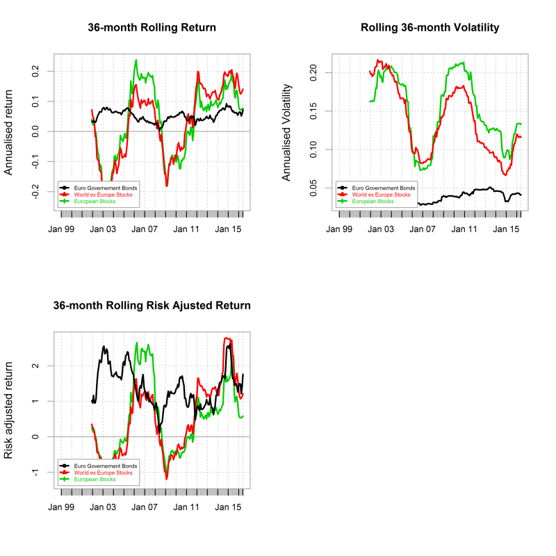
The following is a generic asset allocation report produced from the perspective of a EU investor. I use the Barclay EURO Governement all maturities index, the MSCI World ex Europe and the MSCI EUrope Gross indices (i.e dividends re-invested) as proxies for bonds and equities holdings. As time goes I will add a few more asset buckets such as EM, commodities and properties. So see this as a first attempt to an evolutive product.

The below charts shows the rolling 36-month return, volatility and risk adjusted return for each of the assets used in the final portfolio. Clearly equities have a higher volatility than bonds but also higher/lower localised returns highliting that timing is key in unlocking those higher returns.

plot of chunk Summary charts
The below summary performance statistics show that a EU investor would have got the best risk adjusted return by holding a broad basket of European Governement Bonds. Over the long term the returns would have been quite similar accross asset classes. However the risk as expressed by the annualised volatility of the monthly returns and the maximum drawdown would have been at it highest for equities and particularly for World Ex. Europe stocks.

##                                 Euro Governement Bonds
## Annualized Return                                 4.98
## Annualized Standard Deviation                     3.84
## Annualized Sharpe Ratio (Rf=0%)                   1.30
## Worst Drawdown                                    5.81
##                                 World ex Europe Stocks European Stocks
## Annualized Return                                 5.03            3.79
## Annualized Standard Deviation                    15.03           15.74
## Annualized Sharpe Ratio (Rf=0%)                   0.33            0.24
## Worst Drawdown                                   62.58           55.81

In the following I use a mean-variance model to compute the weights of the portfolio that maximises the information ratio on the efficient frontier.The model is optimised for “long only” and weights adding to one constraints. I use a rolling window of 36-month to estimate the returns, volatility and correlation input fed into the Markovitz model. The use of a rolling window implies that the momentum effect in the input is captured by the optimisation. Therefore if an asset becomes more attractive through time in terms of its risk adjusted return and/or diversification potential its participation into the final portfolio should increase and vice versae.

The two charts below show how the optimised portfolio weights have changed throughout time and also what were the weights at the end of the last month.

plot of chunk weights_chart
Using the above weights I then calculate the return of the portfolio for the folowing period assuming a cost of 0.25% of adjusted notional for each monthly rebalancement. The performance is compared to the return of a portfolio composed of 60% Euro Gov. Bonds and 40% Euro equities.

plot of chunk Opt_porfolio_charts

**Summary Performance Statistics

##                                 Benchmark 60/40 Optimal Portfolio
## Annualized Return                          4.68              5.58
## Annualized Standard Deviation              6.30              4.55
## Annualized Sharpe Ratio (Rf=0%)            0.74              1.23
## Worst Drawdown                            22.62              9.39

Drawdowns Table

##                  From              Trough                  To Depth
## 1 2007-11-30 00:00:00 2008-06-29 23:00:00 2009-08-30 23:00:00 -9.39
## 2 2015-04-29 23:00:00 2015-09-29 23:00:00                <NA> -8.16
## 3 2010-09-29 23:00:00 2011-03-30 23:00:00 2012-01-31 00:00:00  -5.8
## 4 2013-05-30 23:00:00 2013-06-29 23:00:00 2013-10-31 00:00:00  -2.2
## 5 2006-03-30 23:00:00 2006-05-30 23:00:00 2006-08-30 23:00:00 -2.17
##   Length To Trough Recovery
## 1        22     22        8
## 2        16     16        6
## 3        17     17        7
## 4         6      6        2
## 5         6      6        3

Monthly Returns

##       Jan  Feb  Mar  Apr  May  Jun  Jul  Aug  Sep  Oct  Nov  Dec YEARLY
## 2002  0.6  0.0 -0.8  0.6  0.0  1.0  1.0  1.3  1.4 -0.3  0.7  1.6    7.0
## 2003  0.9  1.0 -0.4  0.2  2.1  0.1 -1.4  0.4  1.3 -1.0 -0.3  1.3    4.3
## 2004  0.6  1.4  0.8 -0.9 -0.5  0.7  0.7  1.2  0.5  0.9  1.3  0.8    7.6
## 2005  1.3 -0.3  0.5  1.2  1.4  1.3 -0.1  0.9  0.5 -1.4  0.5  1.3    7.2
## 2006  0.0  0.6 -0.3 -0.2 -1.7  0.1  1.3  1.7  1.0  1.5  0.2  0.5    4.7
## 2007  0.5 -0.2  0.7  1.5  0.6 -0.5 -0.6  0.3  0.3  1.6 -1.5 -0.8    1.8
## 2008 -2.8  0.2 -1.2  0.7 -0.9 -3.5  0.8  1.3 -1.5  0.9  3.7  1.2   -1.0
## 2009 -1.1  0.8  1.2  0.6 -1.2  1.2  1.8  0.5  0.6  0.1  0.6 -0.8    4.2
## 2010  0.5  1.2  0.6 -0.7  1.1 -0.3  0.9  2.6 -1.2 -0.5 -2.6 -0.3    1.4
## 2011 -0.5  0.2 -1.0  0.3  1.0 -0.5  0.1  1.9  0.6 -1.2 -1.6  3.9    3.2
## 2012  2.6  1.8  1.0 -0.2  0.4  0.0  2.7  0.3  1.0 -0.3  1.1  0.6   11.0
## 2013  0.2  1.9  2.2  1.6 -0.3 -1.9  1.4 -1.1  1.1  2.2  0.9  0.0    8.4
## 2014  0.9  1.0  0.9  0.6  2.0  1.4  1.2  2.7  1.0  1.3  1.8  1.5   16.2
## 2015  3.1  2.7  1.9 -1.8 -0.1 -3.4  2.4 -5.1 -0.2  3.3  1.8 -2.3    2.2
## 2016 -1.2  0.5  0.7 -0.9  1.6  1.9   NA   NA   NA   NA   NA   NA    2.7

If you need more information or have questions about the above, feel free to contact me at pollux@argonautae.com

US Investor Allocation Update

The following is a generic asset allocation report from the perspective of a US investor. I use the Barclay US all treasury index, the MSCI World ex US and the MSCI US Gross indices (i.e dividends re-invested) as proxies for bonds and equities holdings. As time goes I will add a few more asset buckets such as EM, commodities and properties. So see this as a first attempt to an evolutive product.

The below charts shows the rolling 36-month return, volatility and risk adjusted return for each of the assets used in the final portfolio. Clearly equities have a higher volatility than bonds but also higher/lower localised returns highliting that timing is key in unlocking those higher returns.

plot of chunk Summary charts
The below summary performance statistics show that a US investor would have got the best risk adjusted return by holding a broad basket of US treasuries. Over the long term the returns would have been quite similar accross asset classes. However the risk as expressed by the annualised volatility of the monthly returns and the maximum drawdown would have been at it highest for equities and particularly for World Ex. US stocks.

##                                 US Treasuries World Ex US Stocks US Stocks
## Annualized Return                        4.77               3.86      4.81
## Annualized Standard Deviation            4.52              17.29     15.20
## Annualized Sharpe Ratio (Rf=0%)          1.05               0.22      0.32
## Worst Drawdown                           5.01              59.39     52.92

In the following I use a mean-variance model to compute the weights of the portfolio that maximises the information ratio on the efficient frontier.The model is optimised for “long only” and weights adding to one constraints. I use a rolling window of 36-month to estimate the returns, volatility and correlation input fed into the Markovitz model. The use of a rolling window implies that the momentum effect in the input is captured by the optimisation. Therefore if an asset becomes more attractive through time in terms of its risk adjusted return and/or diversification potential its participation into the final portfolio should increase and vice versae.

The two charts below show how the optimised portfolio weights have changed throughout time and also what were the weights at the end of the last month.

plot of chunk weights_chart
Using the above weights I then calculate the return of the portfolio for the folowing period assuming costs of 0.25% of adjusted notional for each monthly rebalancement. The performance is compared to the return of a portfolio composed of 60% US treasuries and 40% US equities.

plot of chunk Opt_porfolio_charts

**Summary Performance Statistics

##                                 Benchmark 60/40 Optimal Portfolio
## Annualized Return                          5.25              5.71
## Annualized Standard Deviation              5.63              4.91
## Annualized Sharpe Ratio (Rf=0%)            0.93              1.16
## Worst Drawdown                            19.43              7.29

Drawdowns Table

##                  From              Trough                  To Depth
## 1 2007-12-31 00:00:00 2008-10-31 00:00:00 2008-12-31 00:00:00 -7.29
## 2 2009-01-31 00:00:00 2009-06-29 23:00:00 2010-06-29 23:00:00 -4.74
## 3 2003-06-29 23:00:00 2003-07-30 23:00:00 2004-02-29 00:00:00 -4.59
## 4 2015-08-30 23:00:00 2015-09-29 23:00:00 2016-06-29 23:00:00 -4.57
## 5 2004-04-29 23:00:00 2004-05-30 23:00:00 2004-09-29 23:00:00 -3.31
##   Length To Trough Recovery
## 1        13     13       11
## 2        18     18        6
## 3         9      9        2
## 4        11     11        2
## 5         6      6        2

Monthly Returns

##       Jan  Feb  Mar  Apr  May  Jun  Jul  Aug  Sep  Oct  Nov  Dec YEARLY
## 2002  0.5  0.9 -2.2  2.1  0.6  1.1  2.2  2.1  2.4 -0.9 -0.8  2.2   10.1
## 2003 -0.3  1.6 -0.4  0.5  3.0 -0.5 -4.1  0.5  3.0 -1.2  0.1  1.3    3.4
## 2004  0.9  1.2  0.6 -3.1 -0.3  0.7  0.2  1.8  0.7  1.5  0.7  1.8    6.8
## 2005  0.1  0.5 -0.9  0.7  1.0  0.9 -0.4  2.0  0.7 -2.2  1.7  2.9    7.1
## 2006  3.9 -0.2  2.2  3.6 -3.0  0.0  0.9  2.1  0.4  2.1  1.9  0.7   14.6
## 2007  0.2  1.2  1.2  2.4  0.2  0.0  0.6  0.5  2.2  1.9  0.6 -0.5   10.4
## 2008 -0.9  1.1  0.2 -0.1 -0.4 -1.8 -0.5  0.3 -2.4 -2.4  5.0  3.5    1.6
## 2009 -3.2 -0.6  2.2 -1.9 -1.1 -0.2  0.4  0.9  0.8 -0.1  1.4 -2.7   -4.0
## 2010  1.6  0.4 -0.9  1.1  1.7  1.9  0.7  2.0  0.0 -0.2 -0.7 -1.8    5.8
## 2011  0.0  0.1 -0.1  1.3  1.4 -0.4  1.6  2.2  1.2 -0.1  0.5  1.0    8.6
## 2012  1.2  0.2 -0.1  1.0  0.1  0.4  1.1  0.3  0.2 -0.5  0.6 -0.3    4.3
## 2013  0.2  0.7  0.8  1.2 -1.3 -1.3  1.1 -1.1  1.4  1.6  0.4 -0.1    3.7
## 2014  0.3  1.3 -0.1  0.6  1.4  0.4 -0.5  1.9 -1.0  1.6  1.6  0.0    7.7
## 2015  0.3  1.0 -0.2 -0.1  0.3 -1.5  1.5 -3.6 -1.0  3.2 -0.1 -0.9   -1.1
## 2016 -1.3  0.6  2.0  0.1  0.5  1.8   NA   NA   NA   NA   NA   NA    3.8

If you need more information or have questions about the above, feel free to contact me at pollux@argonautae.com

UK Assets Only Investor Dynamic ETF Allocation Portfolio Update

The following report provides analyticals in respect of an investible ETF multi-asset dynamic portfolio for UK assets only investors (I am clearly not saying nor advising that you should invest in such porfolio, I am just producing this for general information). For my allocation exercise I used Ishares ETF. My choice for the Ishares was purely driven by the fact that they have the longest price history. However, bearing in mind that Ishare Equity ETF have a total expense ratio of 0.40% , I therefore would rather use Vanguard or State street ETFs when available for implementation as they have a far much more reasonable TER (close to 10 bps). So my choice of IShares ETF probably affects negatively the numbers shown in the below.

I used the FTSE 100 , FTSE 250, FTSE high Div. ,UK Property , Corporate Bonds, Inflation Linked bonds and Gilts ETFs as my investible universe. The description of each ETF can be accessed by clicking on the assets and following the web link.

The below charts shows the rolling 36-month return, volatility and risk-adjusted return for each of the assets considered. Clearly equities and property have a higher volatility than bonds but also higher/lower localised returns highliting that timing is key in unlocking those higher returns.

plot of chunk Summary charts
The summary performance statistics show that over the period April 2007 to date a UK investor would have had the best risk adjusted return by holding a broad basket of Inflation linked bonds and the worse by investing in the Property index which suffered hugely during the financial crisis.

##                                 FTSE100 FTSE250 FTSE HIGH Div. Property
## Annualized Return                  0.30    3.24          -4.75    -6.93
## Annualized Standard Deviation     14.53   17.57          17.33    22.89
## Annualized Sharpe Ratio (Rf=0%)    0.02    0.18          -0.27    -0.30
## Worst Drawdown                    45.25   53.05          66.41    79.38
##                                 Corporate Bds Inflation Linked Gilts
## Annualized Return                        0.68             5.94  3.47
## Annualized Standard Deviation            9.67             9.34  6.78
## Annualized Sharpe Ratio (Rf=0%)          0.07             0.64  0.51
## Worst Drawdown                          32.18            14.86  8.49

Below I show the Markowitz Efficient Frontier based on the past 36-month return series. Each investible asset, the minimum variance and tangent portfolio are shown on the plot as well as the in-sample 36-month annualised returns. The Green line is just the risk free line (I assumed zero risk free).

plot of chunk frontier

I then used a mean-variance model to compute the weights of the portfolio that maximises the risk return ratio on the efficient frontier.The model is optimised for “long only” and weights adding to one constraints. I used a rolling window of 36-month to estimate the returns, volatility and correlation input fed into the Markovitz model. The use of a rolling window implies that the momentum effect in the input is captured by the optimisation. Therefore if an asset becomes more attractive through time in terms of its risk adjusted return and/or diversification potential its participation into the final portfolio should increase and vice versae as time goes. The two charts below show how the optimised portfolio weights have changed throughout time and also what were the weights at the end of the last month.

plot of chunk weights_chartplot of chunk weights_chart
Using the above weights I then calculate the return of the portfolio for the folowing period assuming a transaction cost of 0.15% of adjusted notional for each monthly rebalancement so as to factor in bid-ask spreads. The performance is compared to the return of a portfolio composed of 40% Gilts and 60% UK equities.

plot of chunk Opt_porfolio_charts

**Summary Performance Statistics

##                                 Benchmark 40Eq./60Bds Optimal Portfolio
## Annualized Return                                3.49              3.00
## Annualized Standard Deviation                    5.44              6.44
## Annualized Sharpe Ratio (Rf=0%)                  0.64              0.47
## Worst Drawdown                                   6.90             12.90

Drawdowns Table

##         From     Trough         To Depth Length To Trough Recovery
## 1 2015-06-30 2016-02-29       <NA> -12.9        15     15        9
## 2 2013-05-31 2013-06-28 2014-02-28 -4.59        10     10        2
## 3 2010-09-30 2011-01-31 2011-09-30 -4.52        13     13        5
## 4 2012-04-30 2012-06-29 2013-02-28 -2.22        11     11        3
## 5 2014-03-31 2014-06-30 2014-08-29 -1.75         6      6        4

Monthly Returns

##       Jan  Feb  Mar  Apr  May  Jun  Jul  Aug  Sep  Oct  Nov  Dec YEARLY
## 2010   NA   NA   NA -0.2  0.4  1.0 -0.9  4.4 -0.1 -2.6 -0.4  0.9    2.3
## 2011 -2.3  1.0  0.5  0.5  0.9 -0.6  2.0 -0.8  1.9  0.7  1.5  1.4    6.6
## 2012  1.7 -0.1  0.1 -1.9  0.2 -0.5  1.3  0.4 -0.7 -0.8  0.4  0.3    0.5
## 2013 -0.3  1.7  2.1  0.1 -1.4 -3.2  3.0 -1.4  1.1  1.1 -0.9  0.1    2.1
## 2014  0.7  1.9 -0.6 -1.0  0.7 -0.9  0.2  3.0 -1.7  1.5  4.6  0.4    8.8
## 2015  5.4  1.1  0.7 -1.0  2.7 -3.8  2.7 -3.3 -0.5  2.9 -2.2 -1.6    3.0
## 2016 -5.7 -1.8  0.9 -0.1  1.6 -0.5  1.3   NA   NA   NA   NA   NA   -4.3

If you need more information or have questions about the above, feel free to contact me at pollux@argonautae.com