Monthly Archives: November 2015

G10 FX Position Report Update

G10 FX POSITIONING REPORT

Mon Nov 30 23:21:15 2015

The following report aims to provide a gauge to the current market positioning in G10 FX. It focuses on US$ crosses and uses a standardised statistical measures of price deviation as well as a regression methodology to produce an estimate of how stretched currency exchange rates are and also to evaluate how currency managers are likely to be positioned and leveraged in G10 Currency. I use the BTOPFX in the report but can do the computations for any other peer group benchmark.

G10 FX STRETCH MAP

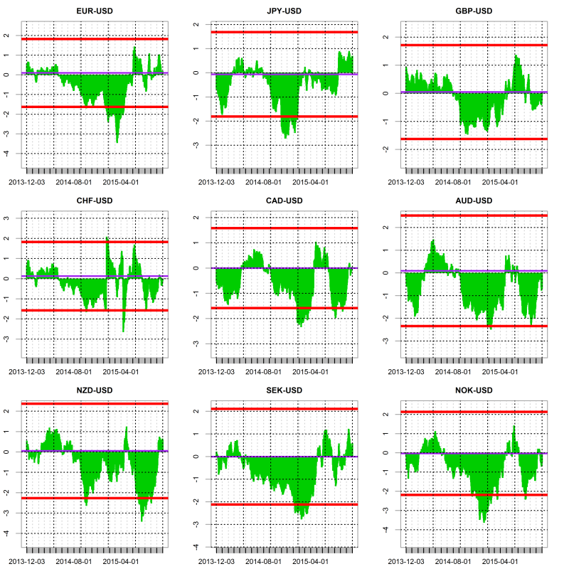
The stretch indicator looks at how much exchange rates are extended by calculating the T-stat of the mean price deviation over a rolling period of 61 days. The charts below shows the results for each currency pairs over the last 500 days. The spot prices are expressed as 1 unit of foreign currency versus the USD. The purple line represent the median value since 2005 and the red lines represent the 95% confidence intervals. Therefore if the value is above or below those the deviation of the given exchange rate would be deemed as atypical relative to what would be expected under a normal distribution and therefore overbought/oversold.

plot of chunk stretch line chart

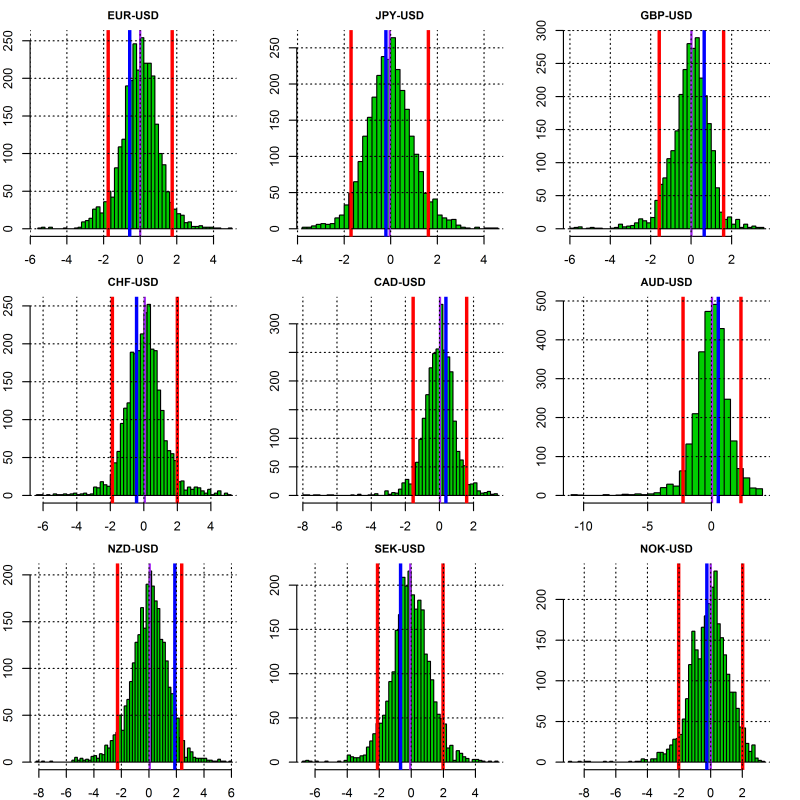
The below shows the above calculated T-stats but this time relative to their historical distributions. Once again the red lines delimit the 95% confidence intervals and the purple line the median value. The blue line indicates the most current value of the T-stat.

plot of chunk stretch distribution

The following Map chart shows how stretched G10 FX exchange rates are over time horizons ranging from 1-month to 6-month. The bigger the square the most significant the upside (green) or downside (red) of the exchange rate over the given period. All the exchange rates are quoted on CCY-US$ basis so red indicate a depreciation of a given CCY against US$ and green an appreciation versus the US$.

plot of chunk stretch map

Estimated Currency Managers Positioning in G10 FX

To determine the sensitivity of currency managers to exchange rates and therefore their current positioning we regress the daily returns of the BTOPFX index against the daily logarithmic returns of G10 FX rates. We then calculate the T-stat for each of the regression’s slope coefficients. The higher the T-stat the higher the sensitivity to a given currency and therefore likely positioning. Using the regression weights as well as the variance of the independent and explanatory variables as input we can then easily deduce an estimation of the current risk utilisation of the typical currency manager as inferred by the values of the BTOPFX.

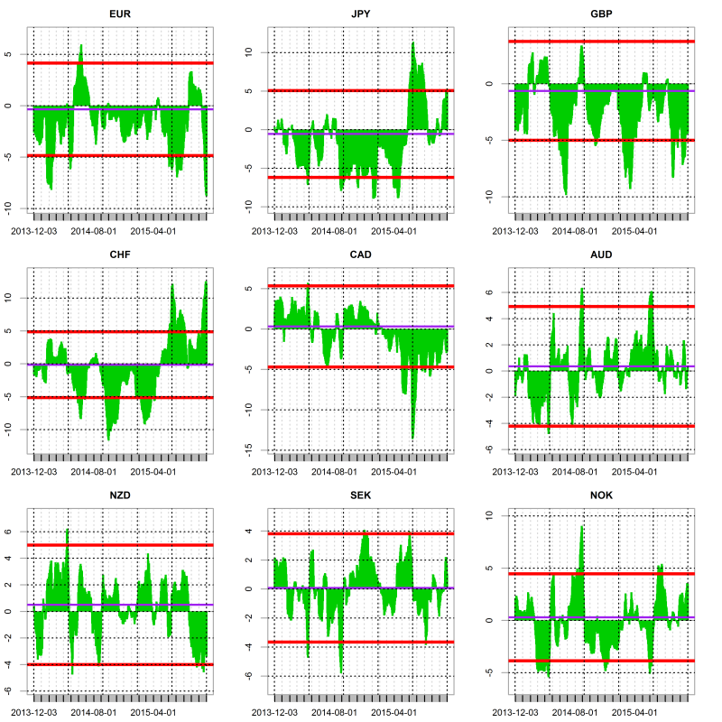
The below shows the T-stat of the regression’s slope coefficients over the last 500 days. The purple line represents the median value since 2005 and the red lines represent the 95% confidence intervals. Therefore if the value is above or below the red lines the positioning in a currency would be deemed as extreme and therefore the risk of unwinding would be greater since the market inventory would likely be close to its highest. Probably highlighting a good environment to enter a contrarian trade.

plot of chunk sensitivity line chart

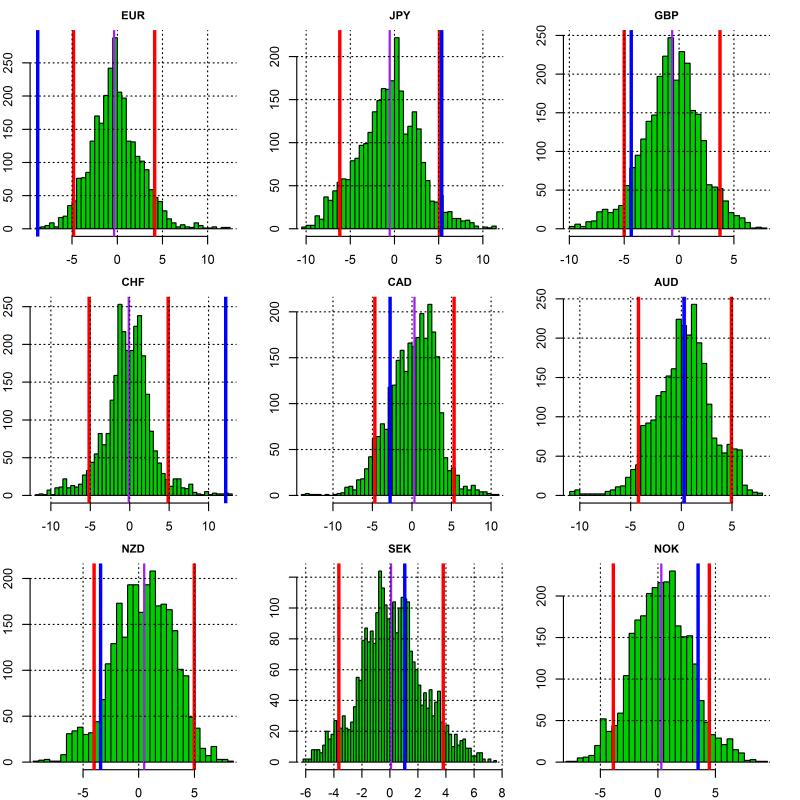
The sensitivity of currency managers returns to changes in G10 FX rates relative to their historical distribution is shown below. Once again the red lines are the 95% confidence intervals and the purple line the median value. The blue line indicates the most current value of the T-stat. If this one is either side of the intervals of confidence it indicates a potentially overextended market positioning in the given currency.

plot of chunk sensitivity distribution

The exposure to the US$ is derived from the combined sensitivities to the other currencies and is shown in the same fashion than for the other currencies. Namely against an axis of time and relative to its historical distribution.

plot of chunk USD sensitivity

The below Map chart shows the currency managers sensitivity to G10 FX exchange rates over time horizons ranging from 1-month to 6-month. The bigger the square the most significant the sensitivity to a currency the exchange rate over the given period. Long positioning is shown in green and short in red.

plot of chunk sensitivity map

Estimated Leverage

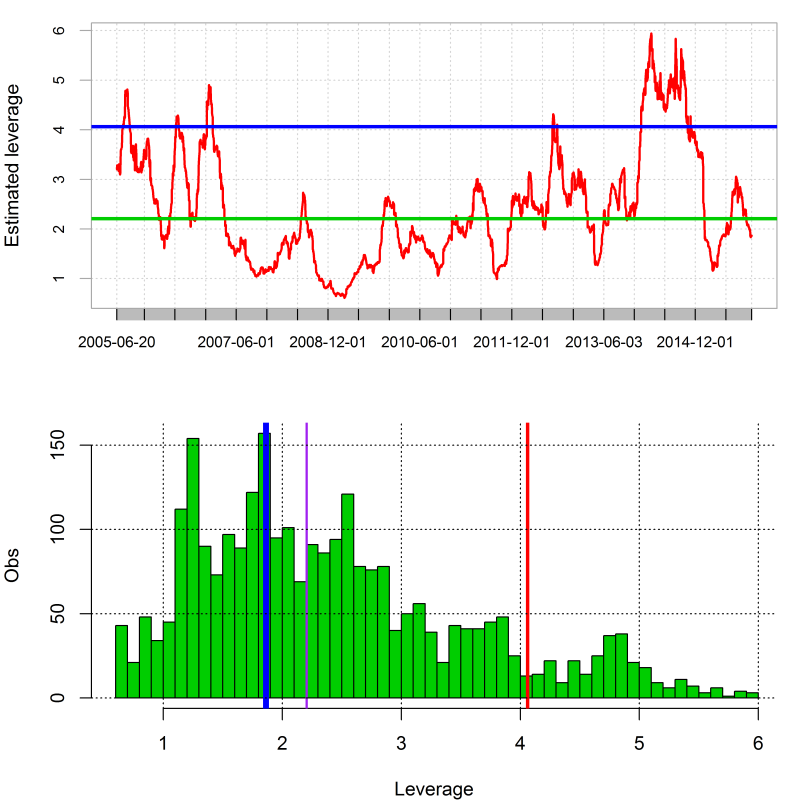
As explained previously the level of risk utilisation of currency managers and therefore their gearing can easily be derived by using the regression coefficients and the variances of both the independent and explanatory variables. The chart below shows the rolling estimation of risk utilisation as well putting it in respect of its historical distribution. Average Risk utilisation over the last 61 days is estimated at 27.92 % of maximum.

plot of chunk leverage

Trade Weighted Currency Indices Stretch Map

Trade Weighted Currency Indices Report

Mon Nov 30 23:09:23 2015

The following report aims to provide a gauge to the current strenght of major currencies. For doing so I use the Bank of England Trade weighted Exchange rate indices and a standardised statistical measures of price deviation to provide an estimate of how stretched major currencies are on a trade weighted perspective.

plot of chunk linechart

I first calculate the T-stat of the mean price deviations over a rolling period of 61 days. The charts below show the results for each currency over the last 500 days. The purple line represents the median value since 1990-01-03 and the red lines represent the 95% confidence intervals. Therefore if the value is above or below those the deviation of the given currency would be deemed as atypical relative to what #would be expected under a normal distribution and therefore overbought/oversold.

plot of chunk rolling chart

The following Map chart shows how stretched the currencies are over time horizons ranging from 1-month to 1-year. The bigger the square the most significant the upside (green) or downside (red) of currencies over the given period.

plot of chunk stretch map
The charts below show how the daily changes in the Trade weighted indices have correlated since January 1990 and since the begining of 2015.

plot of chunk correlation
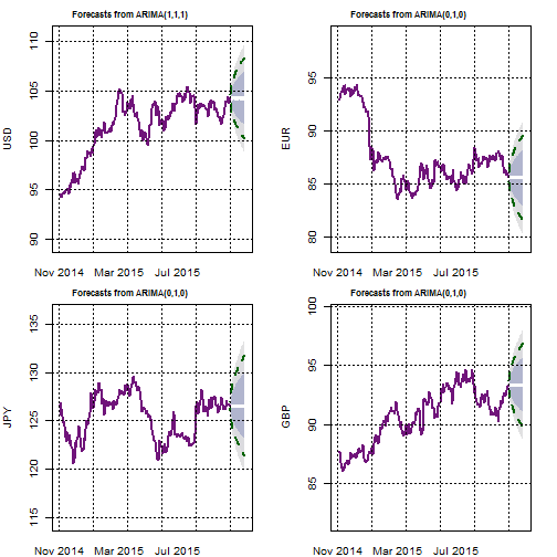
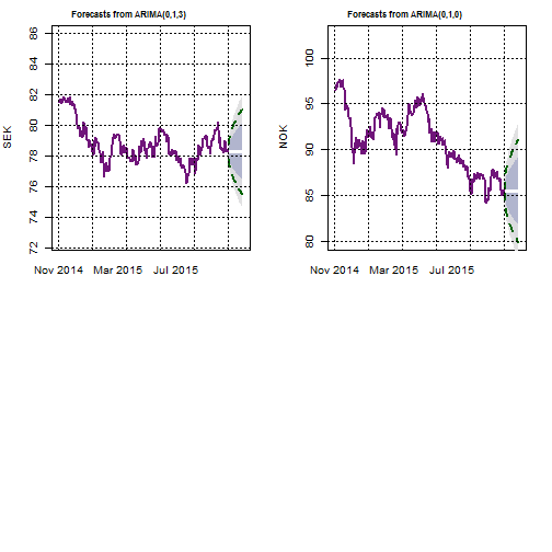
Finally, the following provide an ARIMA forecast for each of the trade weighted indices. My script selects the best ARIMA fit over the previous 250-day to generate a forecast for the next 21 days.
It also shows the forecast confidence intervals.

plot of chunk arimaforecastplot of chunk arimaforecastplot of chunk arimaforecast

US Stock Market Risk Report Update…

The following report provides an update on some of the metrics I use to classify market risk. The word classify is more appropriate as I think that in essence you cannot forecast risk but rather attempt to adjust to it into a timely fashion. Clearly risk would not be a risk if you could forecast it accurately. However as there is generally some degree of persistence in risk regimes, using a dynamic classification may be a useful approach for portfolio rebalancing and hedging. In this report I use the VIX as a measure of global financial market risk. The same methodology can be successfully applied to other inputs. Feel free to contact me at pollux@argonautae.com for more information on the subject.

In my approach I recognise that the nominal level of implied volatility is a crude metric of risk therefore I also use two other measures. The VIX Volga, a measure of uncertainty of risk and the ShockIndex a measure of market dislocation. VIX Volga is simply the volatility of the VIX over a given period. This measure highlights how uncertain and unstable the level of risk has become. Though positively correlated to the level of the VIX the VIX Volga is not necessarily dependent on it. You can have a high level of volga whilst the VIX is trading at rather innocuous levels. This is not a trivial observation as the leverage undertaken by market participants tends to be an inverse function of market volatility which implies a greater vulnerability when volatility becomes uncertain at low levels and therefore cannot be accurately budgeted fo r. The ShockIndex is the ratio between the Volga and VIX at the beginning the historical window chosen to evaluate the Volga. It quantifies sharp changes and acceleration in risk levels. Historically it has proven to be a good classifying measure for market event risks.

The below charts shows those three measures both relative to a time axis and their historical distribution. The red lines are the 95% confidence intervals, the purple line the median. The blue line highlight the current level. The VIX Volga and ShockIndex in this report are evaluated over a period of 14 days. The medians and 95% confidence intervals are calculated over the full history going back to 1990 though the charts shows only the recent years.

plot of chunk riskchart

At close of business the 2015-11-25 the VIX was trading at 15.2 at the 32.2 percentile. The 14-day VIX Volga was estimated at 17 its 64.5 percentile and the shockindex at 1.1 or its 83.3 percentile.

The above charts are useful, however their visualisation is quite limiting. On the one hand we need quite a few charts to present the data on the other hand it is difficult to show the full VIX history going back to 1990 as this would make the charts unreadable. Therefore clustering and aggregating the whole data into a single chart should be useful to the end user. To answer this I use a mapping technique developed by Kohonen in the 1980′. It uses an unsupervised neural network to re-arrange data around meaningful clusters. Though computationally complex is a practical way to summarise multidimensional data into a low (usually 2) dimensional system.

The below chart shows how the VIX price history was split into 4 distinct clusters. Those clusters where computed not only as a function of the VIX level but also as a function of the other variables, namely VIX volga and Shockindex.

Since 1990 the VIX traded 49 % of the time in Cluster 1, 39 % in Cluster 2, 10 % in Cluster 3 and 2 % in Cluster 4. Overall the layering provided seems quite intuitive as the increase in risk and time spent in each cluster points toward what would generally be expected from market risk regimes ranging from low to high risk.

plot of chunk cluster_chart

In the chart below we zoom on the various regimes within which the VIX has been trading for the current year. so far it traded 52 % of the time in Cluster 1, 29 % in Cluster 2, 19 % in Cluster 3 and 0 % in Cluster 4.

plot of chunk ytdriskchart

Finally the below chart shows a Self Organising Map of the above mentioned risk metrics. The data has been grouped and colored as a function of four clusters of increasing market risk regimes. Obviously as shown on the map, the minimum level of volatility pertains to cluster 1 and the highest to cluster4. The current regime and its progression from 21 days ago is also highlighted on the map.

plot of chunk SOM_chart

Always happy to discuss any of the above, feel free to reach me at: pollux@argonautae.com

Non Farm Payrolls time again…

It is NFP time again, sweepstakes must be rife on trading floors around the world…..So it is time to use my NFP forecasting model which leverages on both an ARIMA forecast and a simple linear regression using the ADP as the independent variable to generate a mixed forecast of the NFP.

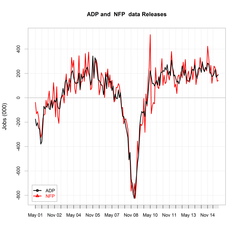
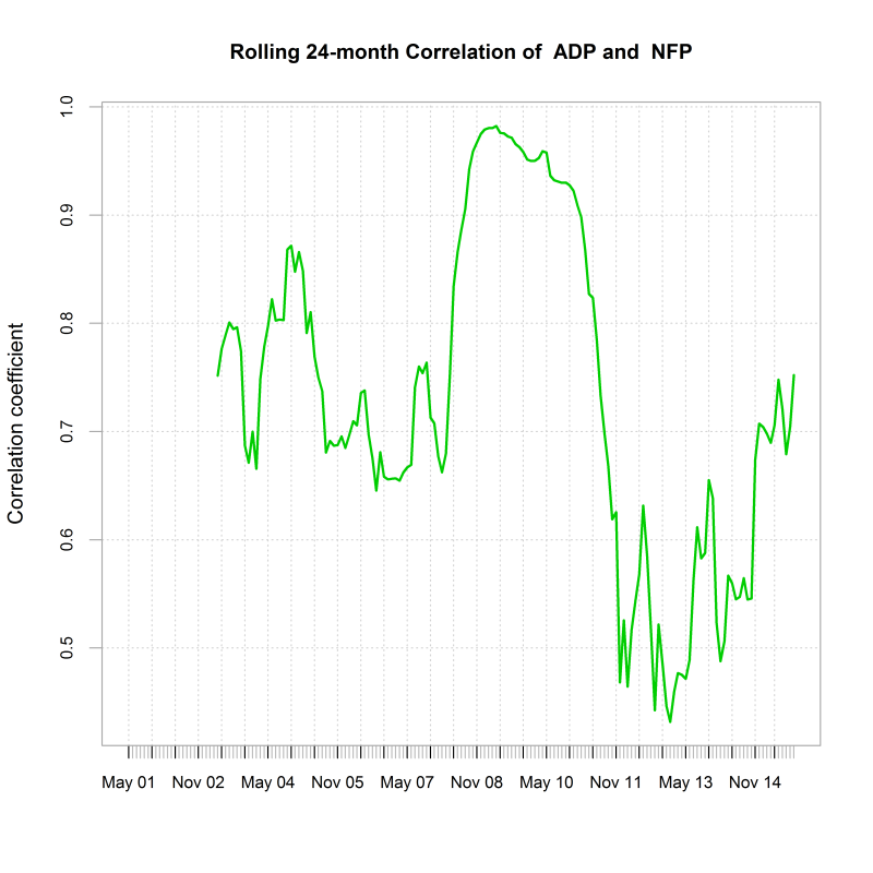
Not surprisingly the ADP and the NFP data releases are positively correlated, thoug this has been significantly time varying. Also the NFP tend to be generally twice as volatile than the ADP numbers, highlighting their challenging nature for a forecaster.

plot of chunk chartsplot of chunk charts

##       ADP                 NFP           
##  "Min.   :-825.57  " "Min.   :-824.00  "
##  "1st Qu.: -42.34  " "1st Qu.: -39.00  "
##  "Median : 132.06  " "Median : 119.00  "
##  "Mean   :  49.91  " "Mean   :  57.29  "
##  "3rd Qu.: 198.34  " "3rd Qu.: 209.00  "
##  "Max.   : 342.63  " "Max.   : 518.00  "

In the below chart I use a 24-month rolling Granger Causality test to investigate the causality at a lag of one between ADP and NFP releases. The chart shows the P-values of the test which indicate in which way the causality,if any, flows. Clearly sometime the ADP has been a leading indicator, other times not.

plot of chunk causality

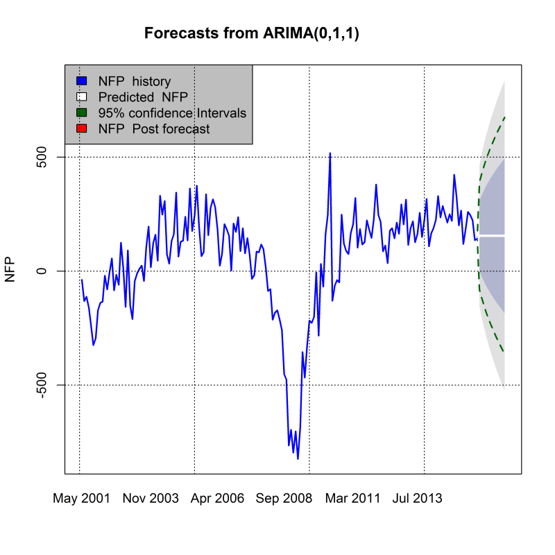
In the below I use an optimising algorithm to find the best ARIMA over the entire sample so as to generate a trend forecast of the NFP. The wide confidence intervals clearly highlight that those forecasts are associated with a high degree of of uncertainty.

plot of chunk arimachart

Finally I use a mixed model to generate an estimate of what the next NFP release will be. The forecast is derived both from a linear regression model forecast with the ADP as the independent variable and also from the forecast generated by the previously fitted ARIMA model.

The LM model forecasts an NFP release of : 186,066 whilts the ARIMA calls for a release of: 155,187 . This contributes to a mixed model forecast of : 171,916

EURUSD Update….

Whatever the market being traded, there always will be a a question being asked at one moment: How far can this thing go ? Clearly not an easy question to answer as this will invariably depends on factors that are partly unknown or difficult to estimate, such as fundamentals, market positioning or market risk amongst others. The first part is obviously to assess how atypical the move experienced in the given instrument is. This report aims to contribute to this.

The below chart shows the EURUSD Spot Price over the period of December 1998 to November 2015 . On the 03 November 2015 it was trading around 1.0864.

plot of chunk chartdata

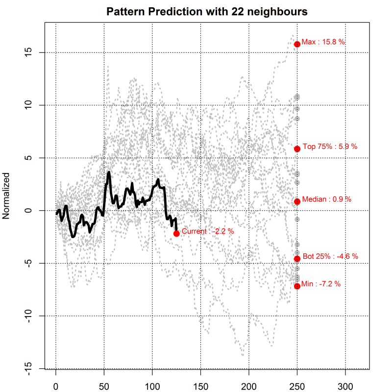
In the below I plot the previous 125 days against other similar historical periods that would have closely matched the recent history. The data has been normalised so as to be on the same scale. The chart shows the latest 125 days in black, and overlay similar historical patterns in grey. It Also shows what has been the price path for the following 125 days as well as the observed quartiles.

plot of chunk pattern

Finally I plot the last 125 days and a trend forecast derived from an ARIMA(0,1,2) model as well as the 95% confidence intervals. The ARIMA model is fitted to the past 625 historical values whilst ignoring the last 125 days, therefore we can look at the recent price path against the trend forecast and its confidence intervals to gauge how (a)typical the recent move has been.

plot of chunk arimaplot

G10 FX Position Report Update

G10 FX POSITIONING REPORT

Wed Nov 04 23:35:52 2015

The following report aims to provide a gauge to the current market positioning in G10 FX. It focuses on US$ crosses and uses a standardised statistical measures of price deviation as well as a regression methodology to produce an estimate of how stretched currency exchange rates are and also to evaluate how currency managers are likely to be positioned and leveraged in G10 Currency. I use the BTOPFX in the report but can do the computations for any other peer group benchmark.

G10 FX STRETCH MAP

The stretch indicator looks at how much exchange rates are extended by calculating the T-stat of the mean price deviation over a rolling period of 61 days. The charts below shows the results for each currency pairs over the last 500 days. The spot prices are expressed as 1 unit of foreign currency versus the USD. The purple line represent the median value since 2005 and the red lines represent the 95% confidence intervals. Therefore if the value is above or below those the deviation of the given exchange rate would be deemed as atypical relative to what would be expected under a normal distribution and therefore overbought/oversold.

plot of chunk stretch line chart

The below shows the above calculated T-stats but this time relative to their historical distributions. Once again the red lines delimit the 95% confidence intervals and the purple line the median value. The blue line indicates the most current value of the T-stat.

plot of chunk stretch distribution

The following Map chart shows how stretched G10 FX exchange rates are over time horizons ranging from 1-month to 6-month. The bigger the square the most significant the upside (green) or downside (red) of the exchange rate over the given period. All the exchange rates are quoted on CCY-US$ basis so red indicate a depreciation of a given CCY against US$ and green an appreciation versus the US$.

plot of chunk stretch map

Estimated Currency Managers Positioning in G10 FX

To determine the sensitivity of currency managers to exchange rates and therefore their current positioning we regress the daily returns of the BTOPFX index against the daily logarithmic returns of G10 FX rates. We then calculate the T-stat for each of the regression’s slope coefficients. The higher the T-stat the higher the sensitivity to a given currency and therefore likely positioning. Using the regression weights as well as the variance of the independent and explanatory variables as input we can then easily deduce an estimation of the current risk utilisation of the typical currency manager as inferred by the values of the BTOPFX.

The below shows the T-stat of the regression’s slope coefficients over the last 500 days. The purple line represents the median value since 2005 and the red lines represent the 95% confidence intervals. Therefore if the value is above or below the red lines the positioning in a currency would be deemed as extreme and therefore the risk of unwinding would be greater since the market inventory would likely be close to its highest. Probably highlighting a good environment to enter a contrarian trade.

plot of chunk sensitivity line chart

The sensitivity of currency managers returns to changes in G10 FX rates relative to their historical distribution is shown below. Once again the red lines are the 95% confidence intervals and the purple line the median value. The blue line indicates the most current value of the T-stat. If this one is either side of the intervals of confidence it indicates a potentially overextended market positioning in the given currency.

plot of chunk sensitivity distribution

The exposure to the US$ is derived from the combined sensitivities to the other currencies and is shown in the same fashion than for the other currencies. Namely against an axis of time and relative to its historical distribution.

plot of chunk USD sensitivity

The below Map chart shows the currency managers sensitivity to G10 FX exchange rates over time horizons ranging from 1-month to 6-month. The bigger the square the most significant the sensitivity to a currency the exchange rate over the given period. Long positioning is shown in green and short in red.

plot of chunk sensitivity map

Estimated Leverage

As explained previously the level of risk utilisation of currency managers and therefore their gearing can easily be derived by using the regression coefficients and the variances of both the independent and explanatory variables. The chart below shows the rolling estimation of risk utilisation as well putting it in respect of its historical distribution. Average Risk utilisation over the last 61 days is estimated at 31.36 % of maximum.

plot of chunk leverage

Trade Weighted Currency Indices Stretch Map

Trade Weighted Currency Indices Report

Wed Nov 04 23:43:36 2015

The following report aims to provide a gauge to the current strenght of major currencies. For doing so I use the Bank of England Trade weighted Exchange rate indices and a standardised statistical measures of price deviation to provide an estimate of how stretched major currencies are on a trade weighted perspective.

plot of chunk linechart

I first calculate the T-stat of the mean price deviations over a rolling period of 61 days. The charts below show the results for each currency over the last 500 days. The purple line represents the median value since 1990-01-03 and the red lines represent the 95% confidence intervals. Therefore if the value is above or below those the deviation of the given currency would be deemed as atypical relative to what would be expected under a normal distribution and therefore overbought/oversold.

plot of chunk rolling chart

The following Map chart shows how stretched the currencies are over time horizons ranging from 1-month to 1-year. The bigger the square the most significant the upside (green) or downside (red) of currencies over the given period.

plot of chunk stretch map
The charts below show how the daily changes in the Trade weighted indices have correlated since January 1990 and since the begining of 2015.

plot of chunk correlation
Finally, the following provide an ARIMA forecast for each of the trade weighted indices. My script selects the best ARIMA fit over the previous 250-day to generate a forecast for the next 21 days.
It also shows the forecast confidence intervals.

plot of chunk arimaforecastplot of chunk arimaforecastplot of chunk arimaforecast